
Reimagining a User Interface, Part 5
Another user interface design challenge World Champ Tech faced while reimagining the workout apps is how to allow users to select different types of interval workouts. World Champ Tech began the project with the goal of providing audio cues to inform users when to start each interval during an interval workout, how much time was left in the interval, and how much time was left in the recovery period between intervals. To accomplish this goal, the reimagined workout apps needs a mechanism for users to input information about the intervals and recovery periods they wanted to follow during a workout. Squeezing this user interface into a modestly-sized Apple Watch screen - which at best is only 396 x 484 pixels in size - posed a significant design puzzle.
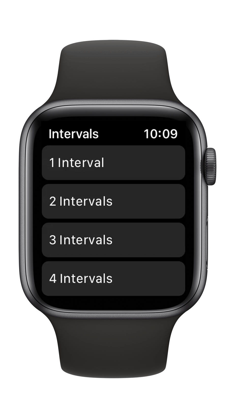
One option was to create a system with a large list of built in interval workout designs, and simply allow the user to scroll through them until they find the workout they want. This system would have two major shortcomings: it might take a tortuously long amount of time to scroll to the desired workout if you provided a large enough corpus of interval workouts to satisfy the requirements of all users, or you might fail to provide the precise interval workouts that a user may want.
Estimating the possible number of interval workouts designs must take into account that each interval workout consists of a number of intervals during an interval set, the duration of each interval, and the duration of the recovery time between each interval. Twenty is an approximate maximum value for the number of intervals during an interval set. The maximum interval duration is approximately 30 minutes, and might be broken up in 5 second increments of time to create 360 different interval duration time values. The recovery time between each interval will mirror the possible interval durations with 360 possible recovery duration time values. The total number of possible interval workout designs is 20 x 360 x 360, or 2.592 million different interval designs. Clearly a simple list of interval workouts would be extraoridinarily cumbersome to navigate by a user.

Cramp-inducing scrolling through a list of interval workouts
If you could classify different workout design into a hierarchical, tree-like structure, you might be able to reduce this burden to some extent, but likely would still be left with 100s of items for the user to select from. In the next example, the user first selects the desired number of intervals in the interval set (5), then selects the interval time (3:30), and finally selects the recovery time (2:15). After selecting the recovery time, the user is presented with a screen to review their selections and start the workout.

Tree of interval workouts interface design
Using a tree-structure for the interface significantly reduces the amount of scrolling required to setup an interval set. But, this approach, still has one substantial failing: you cannot view your previous selections when you make you next selection. So, when you are selecting the recovery time for each interval in the interval set, you cannot see your previous selections for the number of intervals and the time for each interval. There are some possible ways to solve this problem - setting the page title to the previous selected data is one option - but this still appeared to be a less than optimal approach.
Interval designer tree interface
The ideal interface design would allow the user to easily scroll though and select the desired intervals, interval time, and recovery time for the interval set, but also keep all data visible on the Apple Watch screen to aid the user in visualizing their previous selections and facilitate the design of the interval set. This was a difficult, but not insurmountable task. First, the available screen space was divided roughly into thirds, with the top third dedicated to a scrollable list of intervals, interval times, or recovery times. A start workout button was placed in the bottom third of the screen design. The middle third was the critical element that contained three custom buttons that both displayed the user selected intervals, interval time, and recovery time data, and also allowed the user to change the selection mode of the list in the top third of the user interface.

Final interval designer user interface concept