
Maximizing battery life through user interface design
OLED displays like the screen on the Apple Watch have a curious energy usage quirk: black costs much less energy to display than white. In fact, it uses 70% less energy to display a black pixel instead of a colored pixel. Adopting a dark user interface with increased contrast between light text and a dark background not only improves readability, it also increases battery life.
Can we quantify the energy saving by changing to a colored background to a fully black background?
The original Bike+ WatchOS 1 data screen primarily used blocks of dark blue color as a background to separate different data elements. Only 20.3% of the pixels were black, and the mean brightness was 20.9%.
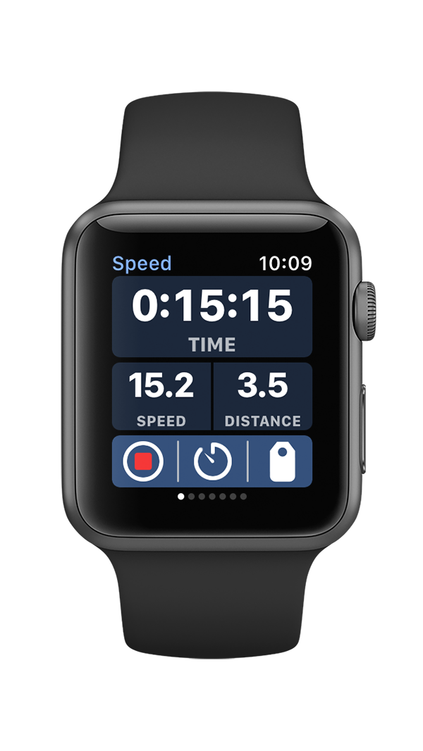
Bike+ WatchOS 1 data screen design with page indicator
The interface design was changed for the WatchOS 2 version of the app to increase the contrast of the text. The color backgrounds behind the text were removed and replaced with color 2-pixel separator lines. This increased the number of black pixels to 74.0% of the total screen pixels, with an average brightness of 14.7%.
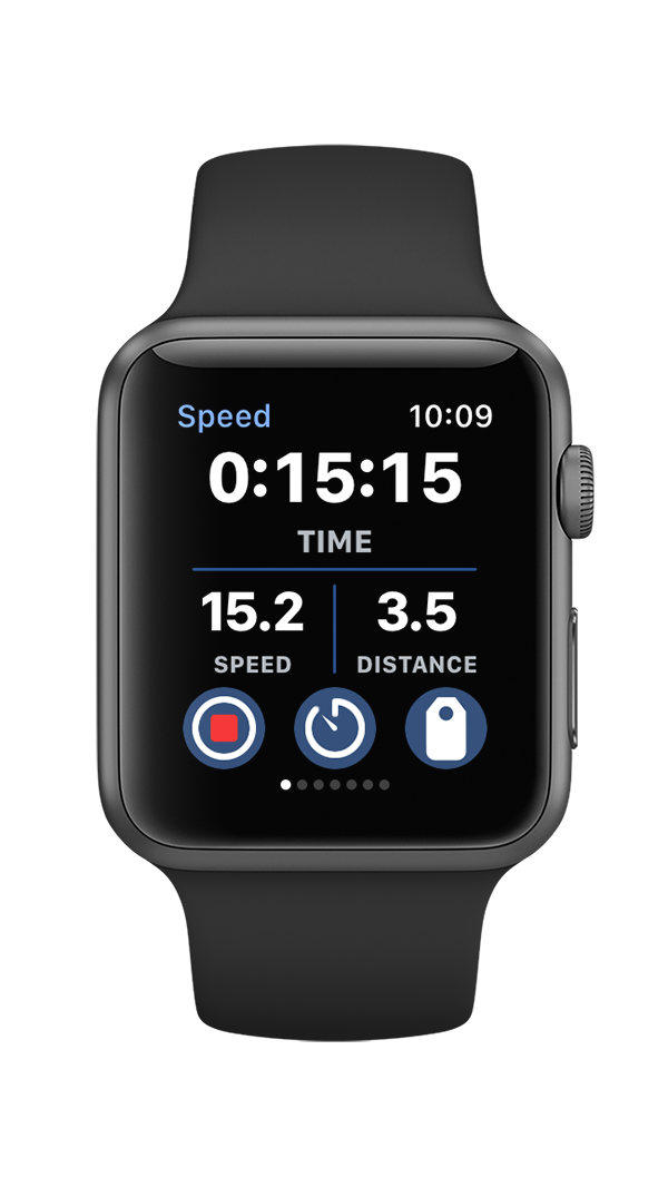
Bike+ WatchOS 2 data screen with color data separators
The design of the new Bike+ app switched to a vertical scrolling page design, and moved the controls buttons to a hidden context menu. Those changes allowed for larger font sizes, further increased the number of black pixels to 82.6%, and reduced the mean brightness to 11%. Cumulatively, these design changes have increased the number of black pixels by over 62%, which has reduced screen power consumption by nearly 44%!
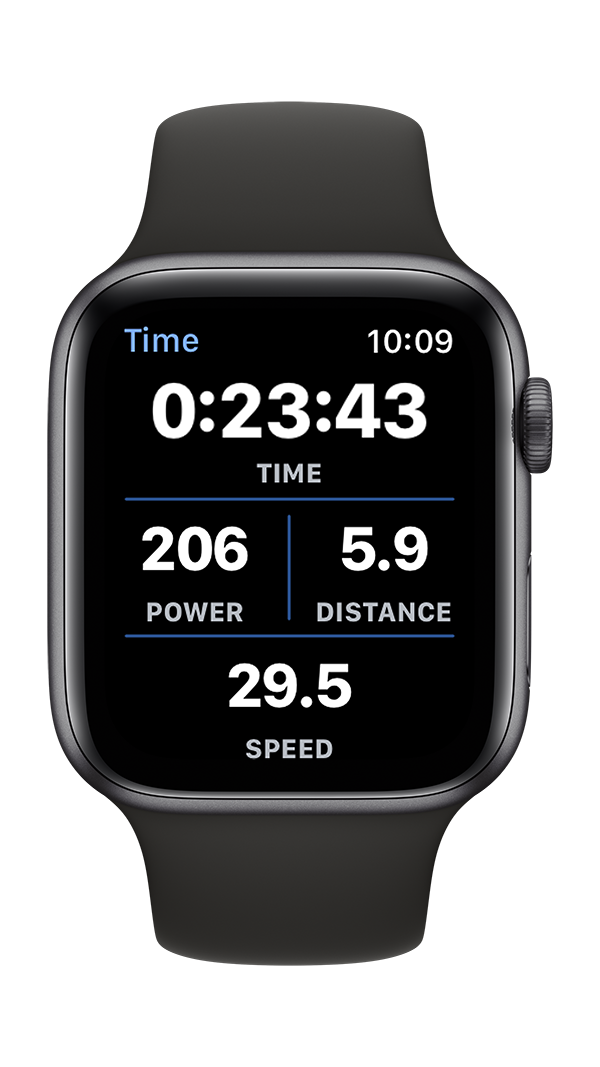
Bike+ time data screen without page indicator and hidden control buttons